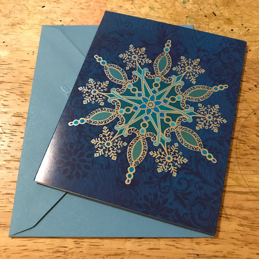
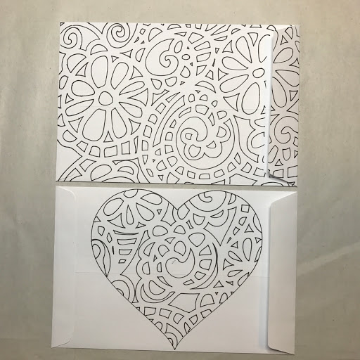
Thursday, November 30, 2017

Updated Tour Schedule

UPDATED Itinerary (as of November 30, 2017)
Changes in Bold

Dec 4 Depart NYC
Dec 5 Arrive Chicago
Dec 6 Depart Chicago
Dec 8 Arrive Seattle
Dec 9 Depart Seattle
Dec 10 Arrive Sacramento
Dec 11 Depart Sacramento
Dec 12 Arrive Denver
Dec 14 Depart Denver
Dec 15 Arrive Chicago
Dec 16 Depart Chicago
Dec 17 Arrive Dallas
Dec 18 Depart Dallas
Dec 18 Arrive San Antonio
Dec 20 Depart San Antonio
Dec 20 Arrive Houston
Dec 24 Depart Houston
Dec 24 Arrive New Orleans
Dec 25 Depart New Orleans
Dec 26 Arrive NYC

Wax Seals


Merry Christmas with red/gold marbling

For my personal Christmas cards, I decided to apply a wax seal to the flap side of the envelope. I wanted something a little bit special for my cards this year. By applying the seal, I incurred the added 21 cent surcharge for special handling. Since the card and envelope is less than one ounce, the special handling makes the postage 70 cents. For my friends and family, I am OK with that.

Since I had several cards to send, I rotated three different stamps so they could cool down between envelopes. While one was cooling off, a different stamp was being used on the next envelope. All of the stamps came from Get Marked Etsy Store.

Since the envelopes were a light green, I wanted to play around with the red and gold sealing wax. I also wanted to  try a marbling effect on some of the seals. The three stamps are Merry Christmas, Joy and Christmas Bouquet.

Merry Christmas with gold only
Christmas Bouquet with red only
Joy with red and gold marbling
I think my favorite combination is the last example. Here the proportions are two-thirds red to one third gold. I like the deep color of the red with the gold highlights. The first example is equal parts red and gold. In the future, if I plan on using just one color, I will dip the stamp in a stamp pad to add color similar to the examples here.

I really do think it adds an eloquent touch to an envelope and it is special enough that people will appreciate the effort.


Wednesday, November 29, 2017

Personal Christmas Cards


For my personal Christmas cards this year, I returned to my stained glass Twelve Days of Christmas series. This is the ninth year so it was time for Nine Ladies Dancing. The theme was greens and reds. I used a new tri-fold frame this year. In previous years, I used an oval frame. As the colored images were getting busier with the larger number of subjects, I decided to cut a rounded rectangular frame so more of the image could be seen. I am very happy with the change. The card itself is pine green in color.

Insert
The insert is made from a printed piece of silver and gold flecked paper from Japan that is mounted on a sage green card stock.

Here is the card with a battery operated tea light.


Lit card
Here is the lit card in the dark. The idea of this series was developed when I first moved to New York City. My first Christmas here, I didn't have the space or money to decorate my apartment for the holidays. I wanted something to put on "the mantle" to evoke the holidays so I designed these cards. When I have been in NYC for the holidays, they have been a tradition. Some of my friends have collected the entire series and display them every year. Three more years and they will be completed.


Tuesday, November 28, 2017

Christmas Cards Swap Bot


Option One for Outer card

This year, I signed up for several swap-bot Christmas card exchanges. I continued a tradition that started several years ago. I purchase holiday cards without a sentiment inside the card. I print out my own greeting and then use it as an insert inside the blank card. I tie the insert with holiday butcher's string to attach it to the card. I have always been concerned with the lack of recycling of holiday cards. While some of my crafty friends will find some way to re-purpose the card, many people will just throw them away or, if  I'm lucky, recycle them.

By using this insert method, the recipient can then re-use the card the following year by removing the insert and putting the card in a standard A2 envelope.  This year, there were two options for the outer card--an ornament or a Noel card.

Added insert
As an added bonus, I also include a small card and envelope from Papyrus. My rationale is this--if I am allowed one ounce to use for a Forever postage stamp, why not send one ounce of material. With the added card and envelope, I was still well under the one ounce limit. There were also two options for the additional card--a Christmas tree made of stars or a snowflake.

Option One for added card
Option Two for outer card
Option Two for added card
Two notes:
One--when tying the insert to the outer card, you have the option of having the bow on the outside or inside of the card. While I prefer to have the bow on the outside of the card, because I was mailing these card, I wanted to make sure that the knot and bow wouldn't interfere with the sorting machine that the post office uses. The added bulk of having the know on the outside of the card can add additional bulk that might get snagged in the machine.

Two--because many people sign up for multiple Christmas card swaps, there are chances that you will get a repeated swap partner. This is the main reason why there were two options for each choice of outer and additional card. In the past, I had one partner get incensed that I had the gall to send a duplicate card to her during a Christmas swap.


Monday, November 27, 2017

The Coloring Across America Tour


OK Folks. Reservations have been made, tickets have been purchased and hotels book. The Coloring Across America Tour will begin in 7 days. I am taking my coloring books and supplies across the Nation to introduce/re-introduce people to the Joys of Coloring. I will be posting specifics of the tour here and sharing photos on Facebook (Coloring Across America Tour) and Instagram (russromano, #coloringacrossamerica). Here is the schedule (subject to last minute itinerary changes).


Dec 4 Depart NYC
Dec 5 Arrive Chicago
Dec 6 Depart Chicago
Dec 8 Arrive Seattle
Dec 9 Depart Seattle
Dec 10 Arrive Sacramento
Dec 11 Depart Sacramento
Dec 12 Arrive Denver
Dec 14 Depart Denver
Dec 15 Arrive Chicago
Dec 16 Depart Chicago
Dec 17 Arrive Dallas
Dec 18 Depart Dallas
Dec 18 Arrive San Antonio
Dec 20 Depart San Antonio
Dec 20 Arrive Houston
Dec 23 Depart Houston
Dec 23 Arrive San Antonio
Dec 24 Depart San Antonio
Dec 25 Arrive Chicago
Dec 26 Depart Chicago
Dec 27 Arrive NYC

I hope you will follow along.

Friday, November 17, 2017

Coloring for the Holidays 3


For today's entry, I wanted to explain some of the descriptive terms that I used when discussing coloring book pages. The first style is what I call the "thin line" style. These are the bulk of the current adult coloring book pages. These are thinner lines and usually appear "free style" which means there is no discernible pattern to the images. The difficulty with this style of image is it can be very unforgiving when using some markers. These are best used for non-wet techniques.

Thin line, free style
The second style is the Zentangle style where every inch of the image is decorated. It is a very busy pattern and you need to decide if large swatches of color will be applied or if every individual section will be colored. I don't find this style very comforting and tend to get overwhelmed with coloring and the composition. Sometimes, I will refer to this as a micro-pattern.

Zentangle Style or Micro-pattern
The third style is what I call a repetitive pattern. This is very similar to wallpaper. Once you decide on the color palette and how to color the individual objects then the rest is just application of color. Sometimes the individual components will be micro-patterned (as is the case below).

Repetitive pattern

The fourth style is the Mandala style. This is a largely repetitive, geometric and symmetrical pattern that radiates around  a center image. Similar to the repetitive pattern above, once you figure out your color pattern the rest is simply repetition. For example, the ovals below would be one color throughout the image, the leaf pattern would be repeated throughout. While the patterns do not necessarily have to be repeated and could be done free style, the pleasing nature of the visual occurs when the patterns are repeated.

Mandala Style
The fifth style was discussed earlier in the week and that is the Lettering/Font style. For this style, the primary image is based on a writing/lettering/font style.

Lettering Style
The last style is what is typical remembered as a coloring book style. Large thick lines that either can be repetitive or free style. When we think of old school coloring, this is the style we remember.

Thick line Style

That is it for this week. I will be back on Monday with another review.


Thursday, November 16, 2017

Coloring for the Holidays 2


Book Cover

Today's coloring assignment came from the coloring book Merry Christmas by Alexandra Dannenmann. I purchased my copy from Amazon for $5.39. There are 30 different designs that all appear on black backgrounds for ease of coloring. The illustrations are simpler in design and not overly complicated which might be more amenable to younger audiences. The book is an odd size in that the pages are 8.5 inches square.

Back Cover
The paper is of a lower quality in that it is a much thinner paper than most adult coloring books. I used Copic markers and Sharpies for my sample. These pages would best be used with non-wet media, like crayons or colored pencils. The paper is super absorbent so blending with wet media doesn't really happen. Wet on wet blending is non-existent. I don't know if blending solutions (e.g., Gamsol) would blend colored pencils very well. Because of the porous nature of the paper, there is some feathering with the alcohol based markers and the Sharpie marker that I used was somewhat problematic. The page is only printed on one side so bleed through is less an issue but you will definitely need a coloring sheet beneath the page you are using if you plan on using markers.

Another difficulty is that the book has a glued spine, which usually isn't a problem, but there are no perforations so the book is meant to be kept whole. I discussed yesterday how I like to separate the pages of my book. When I tried, I got a deckled edge on the left side (glued side) of the pages.

Deckled left edge
As for coloring the page, the illustrations are pleasant enough. In the design below, you can see how blending can become an issue. Originally, I didn't like the dark green color of the holly leaves. To lighten up the color, I used the blender pen to remove some of the color. Then I would normally fill in the lighter areas with a complementary color. As you can see below, after removing the color, the page wouldn't accept another color and I couldn't blend a color either. The paper is so porous I had to leave it as is. While not a catastrophe, it isn't what I wanted.

Also, on the candle, I decided to highlight the artist's design on the candle with a bronze metallic Sharpie pen. You can see how the pen feathered a bit. Granted, I used a fine tip marker. If I had an extra fine tip I might have had a little more control but I think that the metallic extra fine tip markers only come in oil-based paint pens.

Finished page
The first edition of this book was dated 2016 so the publishers should know the expectations of the market when dealing with these books. There should be no reason why a higher quality paper isn't used. Having perforations is pretty standard in these books.

I do like the simpler designs and I will probably color another page or two with non-wet media. I am a fan of the black background because it can hide a variety of coloring sins (especially sloppy coloring).

Note: In an effort for full disclosure, I have purchased all of these items myself and I am not being compensated for my thoughts/reviews.

Wednesday, November 15, 2017

Coloring for the Holidays


Front Cover

During this holiday season, I will be sharing my thoughts regarding some of the coloring options available for those last minute decorating ideas. I will review coloring books, postcards, gift tags and various other options available through Amazon or Michaels. As an effort of full disclosure, I have purchased all of these items myself and I am not being compensated for my thoughts/reviews.

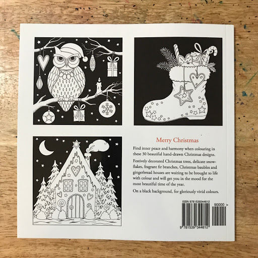
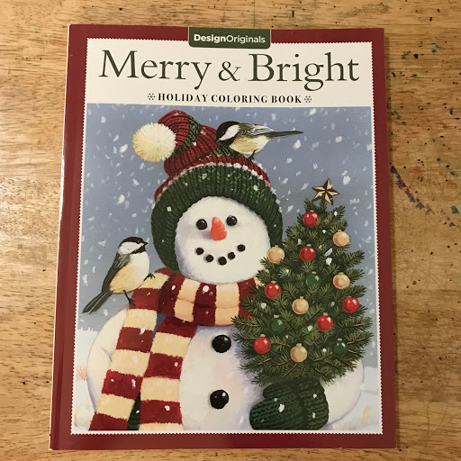
The first item I would like to share is the holiday coloring book by Design Originals called Merry & Bright. I purchased mine from Michaels but it is also available through Amazon. It retails for $5.99.

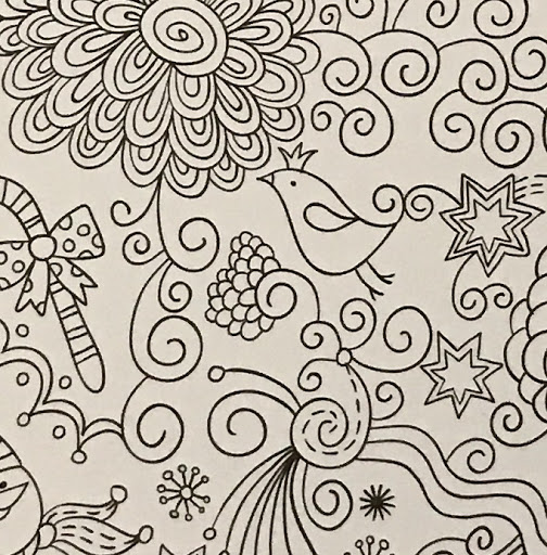
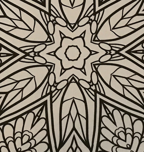
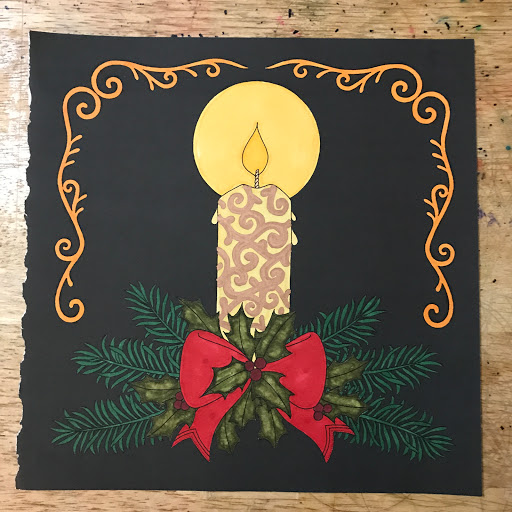
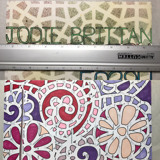
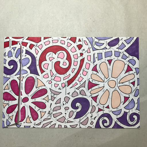
Colored by Russ Romano

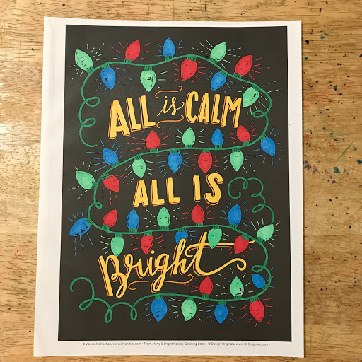
This is the page that I chose to color using my Copic Markers. The book offers a variety of different styles of coloring from six different artists. You can find designs from Hello Angel, Jenny Newland, Robin Pickens, Thaneeya McArfle, William Vanderdasson and Valerie McKeehan.

The illustrations include bold line designs, lettering, thin line designs, micro coloring, and mandala/zentangle type designs. I will define these terms as I go (these are my descriptions and include my preferences/biases).

The design I chose is by Valerie McKeehan and is in the lettering style. This design is primarily based on hand lettering or font usage. When I need an easier (read faster) coloring assignment, I choose one of these images. There isn't a lot of cryptic deciphering necessary. These are broad areas needing color.

I do appreciate that each page is attributed to its designer and is printed at the bottom of each page.

NOTE: As a courtesy to the publishing company and the artists, I will not be providing an uncolored version of the page. Some enterprising people on the Internet have found ways to take these uncolored images and print them for their personal profit. I do not wish to contribute to that enterprise. As an artist who is dependent on these types of products, I want to support the artists so they can receive what is due them through commissions/book sales.
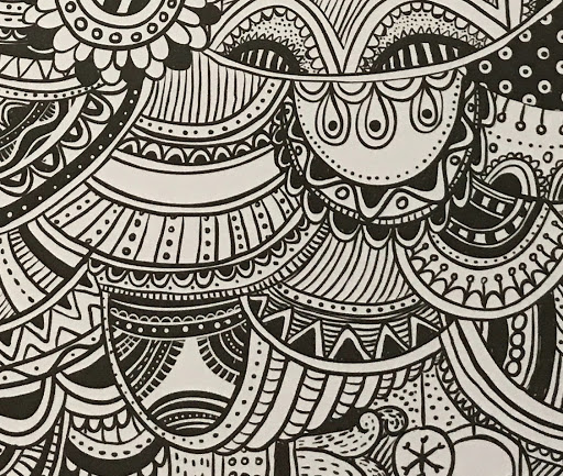
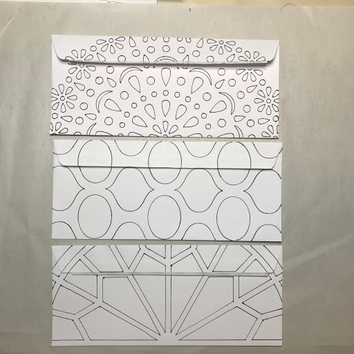
Inside Back Cover
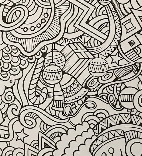
I have included a photo of the inside back cover so you can see some of the other styles available in this book.
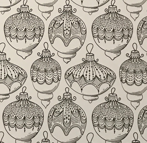
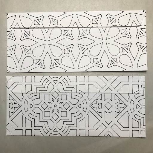
Back Cover
People ask me often why I separate the pages of my book when I color. I primarily use markers for my coloring and many times I forget to insert a coloring sheet. I also like the liberty I get when I can rotate the page without having to worry about spines and resist putting my wrists against a stack of paper. As you can see below, there is quite a lot of bleed through when using alcohol based markers. The quality of paper is good and would probably be good for any non-wet medium. On the back of each page there is a quotation written in light grey ink. There are also lines for writing. I don't know why this is done since it becomes useless when using markers. I am very happy to report that there wasn't any feathering of the ink so the paper receives ink very well.


I really like this book and will eventually color more pages. I also have some ideas for the finished pages that I will share at a later time.

Tuesday, November 14, 2017

Conundrum Solution


Yesterday, I posted about a problem I was having on sending out Christmas cards on Swap-bot. I wanted to send out a card with a surprise for the recipient. I also wanted the envelope to be special as well. I wanted to use a wax seal to seal the flap but it would incur an additional 21 cent special handling surcharge.

I decided to decorate the front of the envelope with vintage/old postage stamps that would total the 49 cents needed. The parcel weighs in at .8 ounces so I am well within the 1 ounce limit for the 49 cent stamp (it is important to give yourself some leeway. My scale weighs differently than the two post office scales that I frequent. If you are ever just at the weight limit, add the additional postage).

For the flap side of the envelope, I decided to use used worldwide Christmas stamps as seals. I got the idea from the Christmas/Easter Seals programs of the American Lung Association. For the history of the program, you can read/donate here.


I think this is a very satisfactory solution to the problem and it lets me thin out my stamp collection. I will be using the wax seal for the mailings to my family and friends.

Monday, November 13, 2017

Conundrum 


I am a little bit an at impasse. I will be participating in several swaps dealing with Christmas/Holiday cards. The cards that I plan on sending out would normally cost 49 cents to mail (which includes a surprise inside the envelope for the recipient). I want to add the wax seal on the envelope as a special touch. But it I do that, it increases the cost of the mailing to 70 cents. To make the mailing more special, I plan on using Forever holiday postage stamps. If I used the wax seals, I will have to wait for the special order of additional postage stamps to arrive and will have to use multiple stamps to obtain the postage needed. So the question is:

(1) do I not use the wax seal and send out with a regular Christmas postage stamp; or

(2) do I use the wax seal and use non-holiday postage stamps; or

(3) do I wait for the additional postage stamps to arrive, and use the wax seal and multiple holiday postage stamps?


Friday, November 10, 2017

Owl Postcard


Owl Outline

This was made for a handmade postcard challenge. The theme was PINK and my partner liked owls. I outlined the stencil first. I used alcohol inks to provide the required pink color.

Pink--First Layer
My partner also liked blues and teals.

Pinks, Blues and Teals
And if one owl wasn't enough. I added a Charlie the Owl stencil on the back in greens, browns and pumpkin colors.

Not another owl
I hope it gets to its destination because there was a little squeak of delight when I delivered it to the post office for postage.

Have a great weekend and Veteran's Day (in the USA).

Thursday, November 9, 2017

More Mail Art


I titled this one the love envelope for obvious reasons. The front side featured an Indian inspired stencil. The recipient liked elephants with trunks raised. She also liked all shades of blues and bright colors. After lettering the envelope, I was lucky to find that the only elephant stencil I had was one with a slightly raised trunk. I placed it in the lower right corner knowing that it would not be obscured by the postage and tracking labels used by the post office.

Front detail
For the back, I had this ready made envelope (discussed here). This was an experiment with a stencil within a stencil technique. I placed the heart stencil in place first and outlined it with pencil. I placed the paisley stencil on top and inked the pattern within the heart. I then placed the original heart stencil back on and inked the outline. The solid shapes were colored with Copic Markers and the heart background plaid was done with Micron pens. The blue background plaid was done with Copic Markers.

Back detail


Wednesday, November 8, 2017

Another Envelope


Nine by Twelve inch envelope front detail
This was another quick envelope that was hand delivered. I am working on the proportions of this particular alphabet style. After lettering the envelope, I took a stencil and alcohol inks to provide color. The only problem is that the envelope was larger than the stencil. Since it was a repeating pattern, it was easy to cover the envelope in two steps. First I colored the left side of the envelope (and masked off the right side edge). I then move the stencil to the right so that it finished the pattern (and making sure that I didn't spray off the left side edge). Once the pattern was continued, I colored the background with a light blue color.

Back side envelope detail
The back of the envelope was a simple two step process. Place the stencil on top of the envelope and provide the background colors (and establishing the positive and negative space). I removed the stencil and did a general wash to to highlight the positive space.

Tuesday, November 7, 2017

More Mail Art


Recent Mail Art
This envelope was used for a flat envelope swap. I had to send 3-5 unused postcards to my partner. She likes pink, purples and flowers. I used flower Forever stamps for the postage.

Front side detail
Back side detail.
I used a new technique for the back of the envelope. I crosshatched the stencil shapes. I then took the original stencil and placed it back on the envelope. I used alcohol inks to add color to the shapes and the background. It was easy to follow the repeating pattern when replacing the stencil on top of the original outlines.


Monday, November 6, 2017

Mail Art


Six by Nine inch envelopes ready to go

Someone asked me the other day, how I have time to make all of the envelopes and mail art that I send. The short answer is that it really doesn't take me that long to do. The longer answer is a bit more detailed.

I don't like to have a lot of idle time on my hands because I would just waste it. So when I am in  between projects, I either organize future projects/supplies or I doodle and prepare envelopes. I take my binder full of stencils and a stack of envelopes and just start doodling/outlining different designs. I don't have a goal in mind; I simply want to get designs on white envelopes. Depending on how much time I have, I will either decorate 9 by 12 inch envelops, 6 by 9 inch envelopes or business size 10 envelopes. I only decorate the reverse (or flap side).

When it comes time to decorate an envelope for use, I hand letter the front of the envelope. If I am using the envelope for a swap, I read my partner's profile to pick a color palette. I will then letter the front and decorate it with alcohol inks to apply a background to the lettering.

After the front is dry, I then color the back of the envelope with markers and then I have a completed envelope. I usually have a stash of 10 to 15 envelopes shelved in the studio just waiting to be used. If I in a bind or don't feel motivated to color, I will use one of my recycled paper envelopes. I have these lying about in dozens just waiting to be used.

Business envelopes ready to color
More business envelopes


Friday, November 3, 2017

Even more mail


\

Another day, another piece of Mail Art. This is another 6 by 9 inch white envelope. I wasn't too happy with the lettering colors chosen because they seemed to wash out once the stencil and alcohol inks were applied to the front. To provide more of a contrast, I outlined the letters with a black Fine Tip Sharpie to make them easier to read. The lettering for this envelope was done in Sharpie Fine Tip markers.

Front detail

For the obverse, I used Copic Markers and a paisley inspired stencil. I really liked this color palette but I don't know exactly why it appealed to me, though.


Have a great weekend and thanks for stopping by.