Saturday, September 30, 2017

Day 30--30 Day Coloring Challenge


Well, this is the last day of the 30 Day Coloring Challenge. I decided to share with you the beginnings of my holiday card this year. For the past 10 years, I have been sending out a variation of the 12 Days of Christmas. It begins with coloring the image, scanning it, and then printing it on vellum. I prepare a trifold card and place the vellum within the fold. These are called stained glass cards because they are meant to be displayed with a battery operated candle within. The below images were from the card sent in 2011.

Four calling birds
Four calling birds with light
The Nine Ladies Dancing image will get the same treatment. The glossy paper is filled in with colored pencils and then blended with Gamsol.

And with that I leave the 30 Days of Coloring Challenge completed. I will take Sunday off and will return to regular blogging next week.


Friday, September 29, 2017

Day 29--30 Day Coloring Challenge


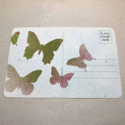
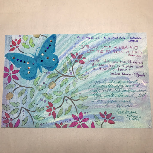
Today's coloring challenge is another extra large postcard from the postcard watercolor block discussed here.  I also wanted to discuss some new handmade watercolors that I ordered from Rachel Beth at her etsy store. Disclaimer here: I have purchased these watercolors on my own and I am not receiving any compensation for this review. To get straight to the review of the product just skip to the end of this blog post.

I have started collecting the watercolors and I am working with the ones that I have on hand. I purchased the half-pans which will be plenty for my use. This is the first time that I have used pan watercolors. Normally, I use Dr Martin's concentrate.

As you can see, 14 half pans can fit in a regular sized Altoid tin. Each pan is labeled with the color and has a small sheet magnet on the bottom of each tin. Using a small tin is the perfect way to carry your watercolors when traveling (which was one of the primary reasons I chose Rachel's shop).

When I work on a project and decide on a palette, I get a scrap of paper similar to the paper that I will be using. I then make a color sample to reference the colors used.

Today's color palette
Here is the sample color palette.

Sample palette

Rachel provides you a reference color dot of each color on the outside of each pan. She also provides you a color sheet for each set. In another post next week, I will share with you my storage system for the unused pans and why these color dots are so important.

Water color tray
When I get started, I mix colors in my tray. To get these colors, I add water to the tray and then lift color from the half-pan. If I want an undiluted color, I work directly from the half-pan with water on my brush.

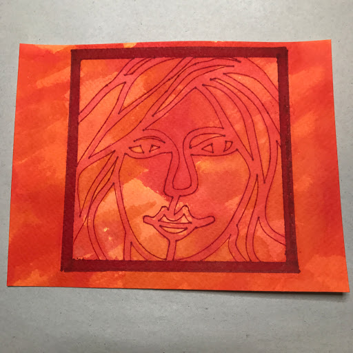
The first step of any painting for me is a color sample on the actual paper that I will be using. Here, I mist the paper to remove any sizing and to get the paper to relax. I also mist the back of the paper so it is easier to manipulate. Usually I will tape down the project but today's project had no margins so I had to work on a loose piece of paper.

Paper and watercolor sample
When I work on the sample, I try to work wet on wet and let the colors blend themselves to see how saturated the diluted color is. I am a big fan of diluted colors. If I had know how well the above sample would have turned out, I would have masked out a monogram or something. Once I know how the materials work with each other, I set up my station.

Today's project
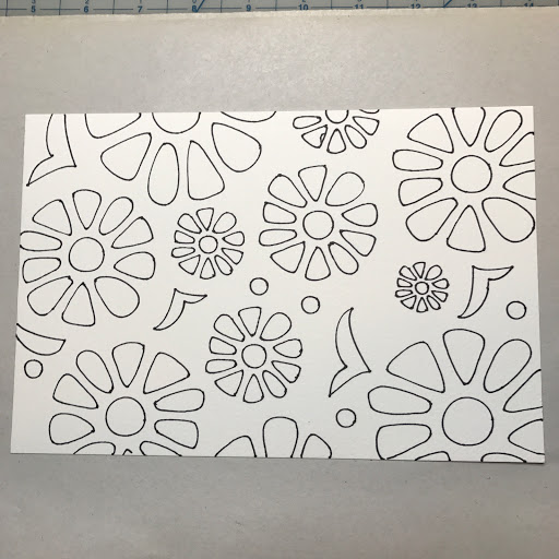
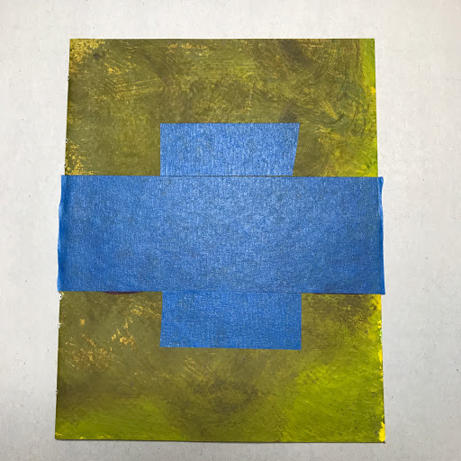
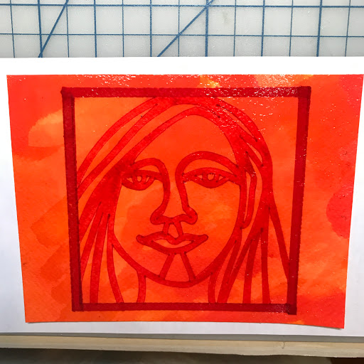
Here is my setup. The tin of half-pans are just to the left of the color tray. To begin, I outlined a stencil onto the watercolor paper with a Micron .05 black marker.


All color added
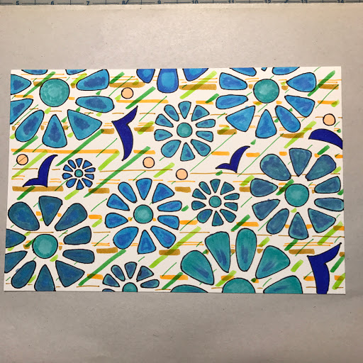
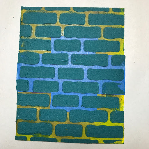
The above image are the shapes with all of the colors from this particular palette. Each color was used in some way or another.  The image below shows the differences in colors from the half-pan (undiluted), those from the color tray (diluted), and those colors that were blended (two diluted colors layered on top of each other, wet on wet). If there is no designation, then the colors fall into the third category. See below for the designations.

Pure vs Diluted vs Layered Colors
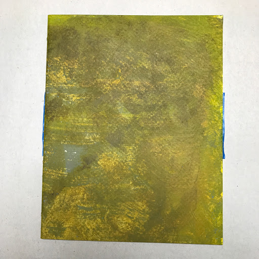
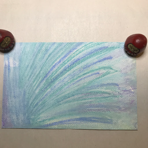
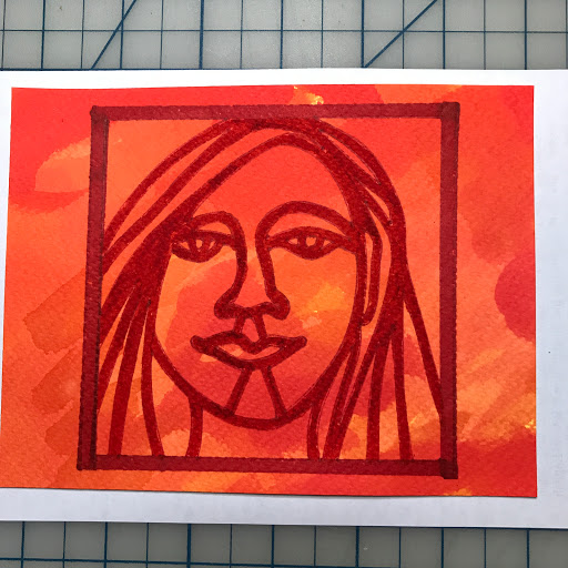
Once the colors were dried with a heat gun, I decided to add color to the background with water soluble crayons from Caran d'Ache.
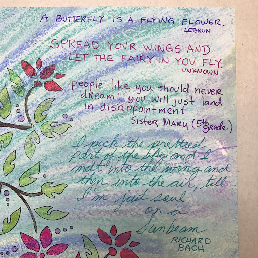
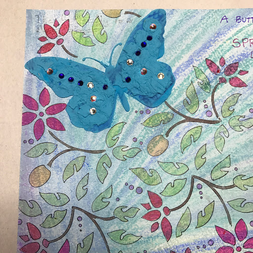
Finished Project
PRODUCT REVIEW
I can't explain how pleasant of an experience that I have had when dealing with Rachel. The dedication and presentation of her product cannot be overemphasized. The colors are amazing and a dream to use. Usually when product lines are in this amount (I think she has nearly 100 color choices), many times there are so many similarities in colors that it is hard to distinguish one shade/color from another. This isn't the case here. The blues aren't interchangeable. The greens aren't either. The colors have a creamy consistency that make them easy to remove them with your brush from the pans. The colors are colorfast and blend beautifully together. More importantly, for me, is that I tend to layer colors rather than blend them. This product is perfect for that and then when they are are the page they are easy to feather into one another. Because they are so easy to layer, this product is perfect for creating shadows similar to those available with blended colored pencils. Several of the arcs above where done with this procedure: base color (often diluted), layer of shadow color (vanilla frosting), third color. Once excess moisture was removed, I feathered the colors into each other with a dry brush. In closing, I can't recommend this product any more highly. Great product, great shop, great seller/owner.

N.B. Please disregard any fault with my watercolor technique. My lack of technique should cause no adverse critique of the product.


Thursday, September 28, 2017

Day 28--30 Day Coloring Challenge


For today's coloring challenge, I wanted to complete the Women in Orange series and my experimentation with masking fluid. This is similar to yesterday's masking technique in that the same areas were masked. You can see the original color wash in the open areas (the areas under the crosshatched areas). In today's postcard, the red box wasn't added until after the top color wash was added. Different today was the application of the masking fluid. Yesterday's masking fluid was painted in the open areas. Today, the masking fluid was applied with a credit card over the stencil. Because some of the fluid gets under the stencil you can see a more distressed effect when the dried masked areas are removed.

Also, yesterday, the top color wash was only added within the red box. Today, I applied the second color wash over the entire card. I added the crosshatching and the red box after the card had dried.

Similarly, I wanted to do something different on the reverse of the card.


As you can see, I was a little heavy handed with the Sharpie marker when making the box and the marker bled through to the back side. I decided to glue a second piece of scrap paper to cover the bleed through and to give the card an extra heft.

I have been trying to come up with alternatives to alcohol inks for use of the reverse side. For today, I used a stencil and used pastel colors to fill the card. Although a strong dark pen would work, I was afraid that any writing would be hard to read.

Pastel Copic markers
I needed to make the card a little more translucent so I used my Zyron machine to apply a piece of vellum to the card. This would provide a smooth surface for writing and would mute the design/colors underneath. I have to say that this turned out better than I expected.

BTW, the mottled look of the markers was intentional. I wanted a watercolor effect with some of the white base paper showing through. I thought the mottled effect would be amplified by the vellum.

Markers with vellum overlay

Tomorrow is a different project and product.

Wednesday, September 27, 2017

Day 27--30 Day Coloring Challenge


Today's coloring challenge is the third in the series of Women in Orange. I am still experimenting with masking fluid and watercolors. Today's session including masking all of the negative space and then adding a water color wash to just the lines in the stencil.

The first step was to apply the general color wash to the post card. The second step was to outline the image with a red extra fine tip Sharpie. The third step was to apply the border with an extra wide chisel tip red Sharpie. The next step was to apply the masking fluid to the open areas of the stencil thereby leaving the thick border lines available for the second color wash. The final step was to apply the top color wash only to the area within the boxed area. If you look closely you will see that the thick lines within the red Sharpie marker lines are a reddish solid color to contrast with the reds, yellows and orange colors of the background.


I also wanted to do something different on the reverse of the card. I wanted to play with stencils and shadows. I didn't want to do another alcohol ink treatment but I needed something that was translucent enough so that writing can be read on the card. I found a fun geometric stencil that I outlined in a black Micron .01 pen. I then used shades of grey to color in the arrows. I designated the address area by a zigzag line in grey.

Tuesday, September 26, 2017

Day 26--30 Day Coloring Challenge


Today's coloring challenge is dedicated to masking fluid. I have never used the product before and I wanted to see what I could do with it. This is a continuation of the Women in Orange series that I started here. This is the second stencil in this four series set. For this card, I applied a water color wash to the card in oranges, yellows and reds. Second, I outlined the image with a red extra fine tip Sharpie. The third step was to apply masking fluid to the area that I wanted to maintain the original color of the postcard. In this case, I masked off the face area. Once dried. I applied another watercolor wash to deepen the color saturation. After this step was dry, I removed the masking with an eraser. In the above image you can see the lighter color of the face in contrast to the darker colors elsewhere. To complete this side of the card, I drew a box around the image in red wide tipped Sharpie

For the reverse of the postcard, I wanted to see how the masking fluid would interact with my alcohol inks.

Step one--basic color.

Step two--apply masking fluid to the image that I want to highlight


Step three--supply the second and third wash of color.


I wasn't totally happy with the contrast in color. I took the original stencil and placed it over the butterfly image and used color to darken the image for a higher contrast. As you can see, the background in step one should have been the color of the butterfly. I added a saturated blue to make it stand out more in the final step.


Monday, September 25, 2017

Day 25--30 Day Coloring Challenge


As we close out the coloring challenge this week, I am deciding to so some smaller projects and maybe one last full size coloring page from one of my coloring book collections. Today, I wanted to test a new product that I found at a local art store. It is Canson watercolor cold press paper in a 6 inch by 9 inch block.

Watercolor blocks are usually sheets of paper that are glued together. You paint on them and they warp less because they are attached to all of the other sheets. When you are done, you separate the top sheet from the rest by slipping a sharp edge directly between the top sheet and the rest of the block. I usually buy Arches cold pressed 140 lb 20 sheet blocks in larger sizes, either 14 in by 20 in or 18 in by 24 in. I like coloring the full sheet with one color palette and then cutting it in smaller pieces and adjust/augment a smaller piece.

I decided to use Copic markers to see how the color worked on the paper. I used a stencil and an extra fine tip Sharpie to outline basic figures.

Basic figures
The Sharpie didn't feather and stayed color fast on the paper. I will have to say that both sides of this paper are fairly smooth or without tooth. Most watercolor blocks usually have one side that is smoother than the other.


I will have so say that the color feathers a little bit on this this paper so it is easier to color to the line rather than one the line. Also, the alcohol in the Copic markers darkens and saturates the permanent Sharpie outlines. So, while the markers are steadfast, the Sharpies in combination with the paper and alcohol of the Copics will feather.

I still haven't decided what to do with the reverse side. I will probably just make this an over sized postcard. I might use alcohol inks on the reverse or do a collage or image transfer.

Sunday, September 24, 2017

Day 24--30 Day Coloring Challenge


Finished Postcard Front

I am sure that you were tired of seeing my Art Journal, so I decided to do a different project for today's coloring challenge. I decided to do a simple postcard.

It all started when I mistakenly purchased a book of postcards at a Japanese bookstore. I thought they were coloring postcards--ones with images that you applied color. But no, they were blank postcards that were printed on the back with address lines and a postage box.

Blank postcards
Back of postcard

I took one of my smaller stencils and got busy applying a design. I used a extra fine Sharpie in black to outline the design. Since they flowers looked like cherry blossoms to me, I decided to use a pink palette. I used Copic markers for coloring and since these cards had a smooth surface, the color flowed nicely. Each petal was colored with three colors (RV23, RV04, and R32), The diamond shapes were filled in with a contrasting blue color (B29).

One of my favorite color combinations is chartreuse and pink. So, I decided to color in the background with FYG2.

Postcard before coloring
I wanted to do something on the back of the postcard because the white background is so shockingly white. I got one of my favorite butterfly stencils and used my alcohol inks in the same color palette as the front of the card (pink, chartreuse and blue). I love the pointillist effect of using alcohol inks and stencils. 


Saturday, September 23, 2017

Day 23--30 Day Coloring Challenge


Just a little coloring
Today's page is yet another page from my Art Journal. This was a last minute project since I was struggling with something to do. I was flipping through my quote books and this quote spoke to me. I did a simple color wash on the page and let it dry.

Next, I searched through my stencil stash to find something that resembled a sun shape. I knew that I had some larger mandala stencils and stumbled across this one. I outlined the partial mandala in black .03 Micron pen. After letting it dry, I filled in the shapes with Copic markers. I added crosshatching with red and orange gelli roll pens. To take off some of the sheen, I used Ranger Distress Oxide inks in Orange, Pink and Amber (or Spiced Marmalade, Worn Lipstick, and Fossilized Amber)--see N.B. below.

I added the quote using a newly discovered letter guide (and I now realized why it was hidden for so long). I should have just inked in the quote myself. I found some stickers that were applicable but they had disturbingly white backgrounds so I used the same distressed inks to make them blend more with the page.

Finished page

While I am not totally 100% happy with the result, it is respectable. The beautiful thing about an art journal is that you can always append, fix, change at a later point. I might gesso over parts and start again. Or I might tint some tissue paper and cover the quote and try again.

N.B. I hate the cuteness/girly level of color designations in the crafting world. I understand that most of the crafters are women but there isn't a need to cater to this audience. Pick color names that truly reflect the color. Variations of pink are fine (hot pink, coral, etc). But "worn lipstick" just doesn't reflect the real color. Plus when I demonstrate, I just can't let the words "worn lipstick" tumble from my lips. I always use the base color designation much to the chagrin of my students. We always get a big laugh out of it and by the time I get to the end of the demonstration we have made some really funny name designations as we try and outdo each other.

During my last class, we came up with "CSI New Orleans stabbed to death three hours ago deep purple dried blood red."

Friday, September 22, 2017

Day22--30 Day Coloring Challenge


For today's coloring challenge, I decided to color a single page in my Art Journal. This was a quick and easy project since I had a lot going on. I forgot to take a picture before I started so I took a picture of the opposite side of the page. Each of these signatures is made up of two pages folded in half. Therefore, there are three two page spreads and two single spreads. So in essence, I decorated page 1 but decided to use page 8 as the before picture. These two were colored at the same time.

After letting the paint dry, I lettered the words and then masked them off with painter's tape since I wanted to do a modeling paste treatment on the page.

Lettering done and hidden
I mixed some modeling paste with blue and green Doc Ph Martin's watercolors. I mixed in brown to get a darker shade. I then used a brick stencil to apply the paste.

Ready for the reveal
After lifting off the tape, I outlined each brick with black Sharpie and filled in the areas between the bricks. I then distressed the bricks and mortar with a Pentel white gelli roll pen.

Top to bottom

Bottom to top
The concept behind the message and how Fear prevents us from doing things in life. Sometime fear blocks you and walls you into a certain type of living and seeing the world. Conversely, many times we can also hide behind Fear so we don't have to delve into a non-comfort zone. How many times has fear of the unknown prevented you from doing something?


Thursday, September 21, 2017

Day 21--30 Day Coloring Challenge


Full Page in Art Journal
Today, I decided to share with you another spread in my personal Art Journal. I had shared this color wash spread in a previous post. I decided to fill the page with a quote from myself and some images from a couple of stencils from my stash.

The sentiment comes from my diary that goes on to explain the effects of loneliness. The entire quote reads "Sometimes I sing because I am afraid: of the silence, that I am going deaf, or that no one knows I am here."

The birds were colored with fine tipped Sharpies and the outlines were done with extra fine tipped Sharpies. Because the pages are textured and treated with fixative, I couldn't use my Tombow markers. Tomorrow, I will try to see if my Copic markers will work.

To add interest, I included some international postage stamps featuring birds.

Left page detail
Right page detail


Wednesday, September 20, 2017

Day 20--30 Day Coloring Challenge


Base page

For today's coloring challenge, I wanted to share a page in my personal art journal. The first step was to fill the page with color. In this case, I used pastel sticks in shades of blue and purple. I blended the colors with a cosmetic sponge and then set the color with fixative.

Completed Page
The second step was to add two interest with two separate stencils. First I laid down the butterfly and then laid down the flowers/petals. Originally, I did a zentangle design on the butterfly but didn't like the way it turned out. To cover it up, I tinted Golden light modeling paste with Ice Blue liquid watercolor (Dr PH Martin's). I then applied a thin layer using the stencil. I then added an additional layer that I then textured for interest.

I colored the flowers and leaves with Tombow markers. I added the quotes with a extra fine tip Sharpie is complimentary colors.

Right side detail

Left Side Detail


Tuesday, September 19, 2017

Day 19--30 Day Coloring Challenge


Watercolor wash and Sharpie

When the Iron Craft Challenges ceased, I was looking for an opportunities to challenge myself creatively. One of the reasons that I liked the Iron Craft Challenges was they would many times force the artists to create something out of their comfort zone. Since you were only making things for yourself, rather than to exchange, as the creator you weren't getting judged or graded. The community was a very supporting one.

I had been on swap-bot before and many times, I always gave better than I received. I didn't mind it so much because I was always looking for opportunities to create and I could always just join the swaps in which I felt comfortably participating. The problem with swap-bot is that all exchanges get rated so if you get a particularly nasty person, and there are plenty, it gets a little disheartening when you are rated down because of a perceived slight especially if they don't give you an opportunity to correct it.

For today's coloring challenge, I decided to share a postcard that I will be sending out today. The theme was a handmade postcard in Orange.

For the front, I did a watercolor wash in shades of orange. I then stenciled an image of a woman's face. This particular stencil has four women's faces so I did a series of four postcards. The top image is the front of the post card after the first treatment.

For the back of the card, I used my alcohol inks with a paisley stencil.

Back of post card
To finish the front of the card and to make it a little sturdier to send through the mail, I put a coat of gloss ModPodge to seal the colors. As you can see, the stenciled imaged lightened in color and the orange watercolor wash really pops.

Finished post card


Monday, September 18, 2017

Day 18--30 Day Coloring Challenge


For today's coloring challenge, I decided to color a floundering page in one of my own coloring books.This was the coloring book that was send to other artists to color in a swap-bot coloring book exchange.There are five two-page spreads and each of the artists were asked to color two different two-page spreads.This is the remaining spread. This is a star mandala stencil from my stash. I decorated with background markings so that the lines would help guide the person coloring the page, if they needed. As you can see, the unidirectional lines show which element belongs with each other. It's almost a paint by numbers without the numbers. If the artist chooses to go in a different direction then  no one is the wiser.

The first step was to add color to the elements of the positive space (the parts with the lines). Each section was colored using four different colors. The first level (innermost layer) was colored in three shades of red (R37, R05, RV25). The middle level was colored in three shades of orange (YR16, YR18, YR02). The outermost level was colored in three shades of yellow (Y35, Y10, Y38). To unify all of the levels, a fourth shade of yellow (Y17)was used to highlight the centers of each element.

The second step was to highlight the positive space by using a dark color for the negative space. I was getting a Mediterranean vibe to the coloring scheme so I decided to use a dark blue to make the other colors pop off the page. In this case, I used B69.

To finish the piece, I used a gold metallic Shapie (fine) to add gold dots to the negative space.


BTW, the color designations above are for Copic markers.


Sunday, September 17, 2017

Day 17--30 Day Coloring Challenge


Today's coloring challenge is the reverse of the envelope I shared with you  yesterday. Another stencil from my collection, I colored with with Copic Markers and then added the background plaid with Micron pens in .03 (orange and red) and .05 in orange. Another quick and easy envelope.