Thursday, August 31, 2017

Postage Stamp Collecting


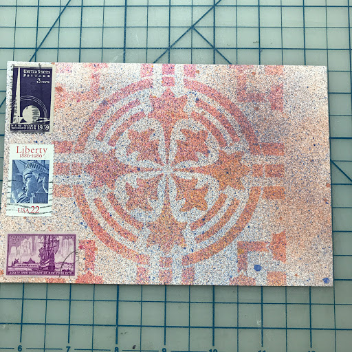
Today, I wanted to share with you another collection of mine. I have always been infatuated with postage stamps ever since I was young. A friend of my mother was an avid stamp collector. He had albums upon albums of postage stamps. He used to collect international postage. He was rabid in his pursuit of collecting and even gave me my first album when I was in high school.

I like the idea of collecting postage stamps but didn't have the required patience or the dedication to keep them in the order required of a proper album. As a matter of fact, he took my album and stamps away from me since he said I couldn't do the stamps "justice."

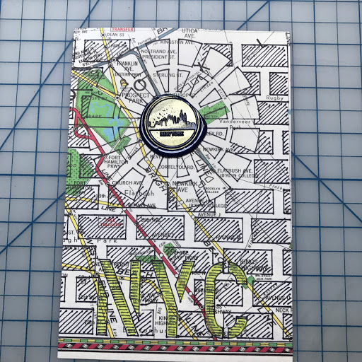
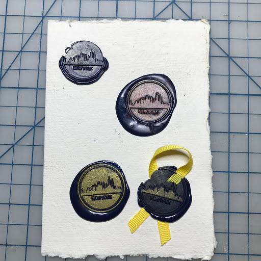
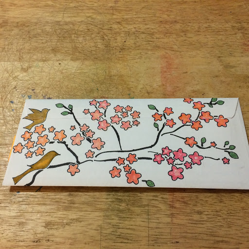
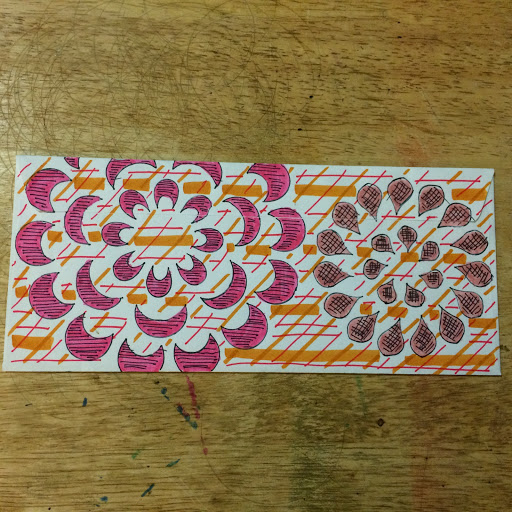
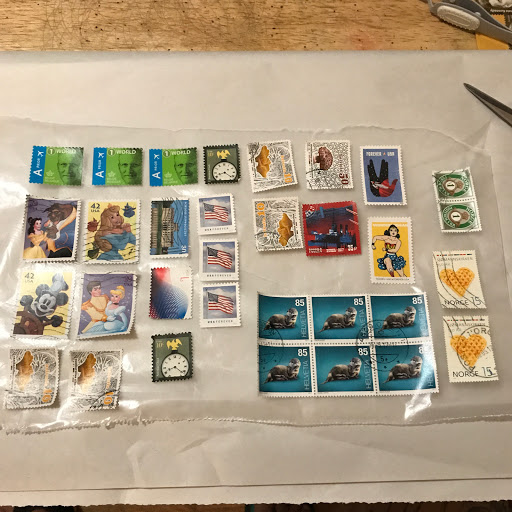
I like postage stamps as artwork instead. I didn't care if they were important or expensive but instead I cared about the artistic aspect of the stamps. I used to glue stamps into my diaries as I was growing up so I like that way of preserving them rather than putting them in books to be stored away.

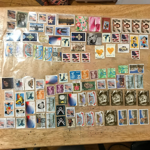
I still enjoy collecting them but now I enjoying just collecting from mail. I still buy in bulk but I more enjoy actually receiving mail and taking the stamps from their paper backing. The solution I use preserves the glue on the stamp so I have to place them on wax paper until I need to use them.

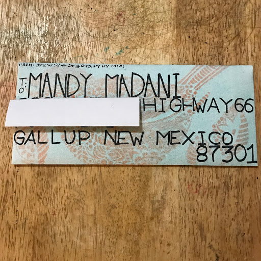
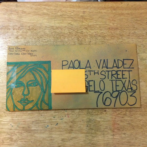
What most people don't realize is that postage stamps in the United States can be used again if they have not been cancelled (where the face of the stamp has been defaced). I never figured out why some stamps get cancelled and some do not. But if the stamp is not defaced you can use it again. With the advent of the Forever stamp in the United States the current value is 49 cents. So two Forever stamps is approximately $1. With as much mail I send, these free stamps add up. Most of my swap-bot postage is sent free of charge.


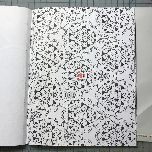
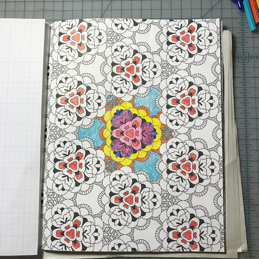
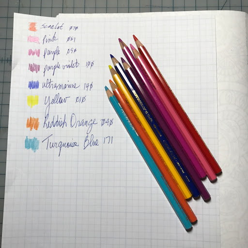
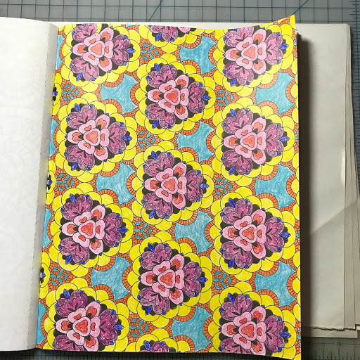
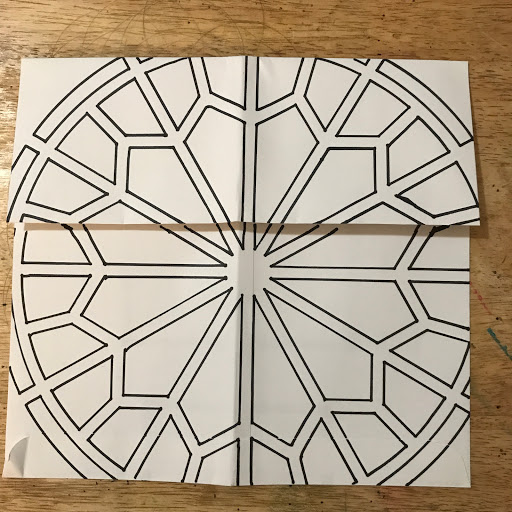
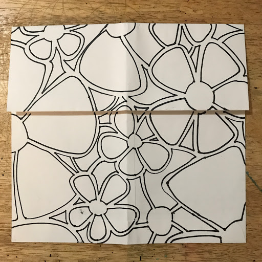
Tomorrow, I will be participating in the 30 Day Coloring Challenge hosted by Kathy. Therefore, the majority of my future posts for September will be dedicated to this challenge but I will be posting additional material on several days.

Wednesday, August 30, 2017

Another NYC Postcard


This was another postcard swap. This is the last piece of the vintage subway map that I had in my supplies. I have always loved the Guggenheim so I decided to do a cut out and put it on the front of the card. I was lucky to have an Andrew Lloyd Wright used postage stamp that had the Guggenheim in the background (top left postage stamp). I continued to fill the page with NYC postage stamps.


For the reverse side, I used a different NYC stencil that had NYC locations in print. I added color to the postcard with alcohol inks. I used the same wax seal from yesterday to divide the salutation section from the address section of the postcard.


Tuesday, August 29, 2017

NY Post Cards


Today's entry is a postcard swap that I did. The theme was sender's choice and I had some scraps of paper from a subway map that I had left over from a previous project. I glued the paper to a watercolor card that I had cut previously. I used a NYC stencil set have several manhole covers, bricks, and the letters NYC. I used a extra fine tip Sharlie in black. I filled in the bricks and letters to create some dimension. I used a yellow marker to highlight the letters of NYC. I then used my new NY wax seal to create the raised button on NYC manhole covers. I stamped the seal with gold pigment ink before pressing into navy blue wax.


For the reverse, I used alcohol inks to create a Tokyo manhole cover. The manhole system in Japan is world renown and the Japanese people take extreme pride in them. There are many special covers and many covers are designed specifically for the local market. There are an estimated 6000 manhole covers in the country of Japan. If you want to find out more and see pictures, please visit here.

To add interest to the reverse side, I found some amazing used NY postage stamps from my collection to tie the front and back together.


Here is the wax seal page for the new NY wax seal.

Monday, August 28, 2017

Another Coloring Page


Today, I wanted to share another coloring assignment with you. The above image is the final image that has been blended. I used Caran d'Ache Supracolor Soft Pencils and water to blend the color.

I tend to prefer repeating patterns when coloring. So the first step is to define a pattern and start coloring it in. Once the pattern is completed, I start coloring each element within the pattern for the entire page. I then move on to the next element of the pattern.

Here, I started with the hearts that are at the center of the pattern.


You can see the whole pattern as it is planned. I forgot to take a photo of the second step but you can see it clearly below. This picture was taken after the third step when I started to fill in all of the red hearts.


I always keep a reference sheet as I go along. With these busy patterns, it is always easy to miss or forget a single element within the pattern. I keep the pencils aligned in the order I used them and always have a fully labeled color swatch handy just in case the pencils roll off my table.


Here is the fully colored page. The final step is to blend the colors with a medium tipped water brush. I used a Pentel Arts Aquash brand.


Friday, August 25, 2017

Even More Mail Art


You can put as much or as little effort in your envelopes as you want. Here is a simple design but added interest is created by blending using my Copic markers.


Here added interest is created my crosshatching and creating a background. The plaid background is easy especially when you need to fill in a lot of space.


This is a basic geometric stencil with crosshatching and another plaid background.


Here, I wanted to create something special because I was sending my journal to be included in a touring art journal exhibit. A mandala stencil above and my favorite floral stencil below.


This is generally the process that I use when creating a piece of mail art. Usually, I create the main image with stencils and markers. If I am creating the address by hand, I usually begin with that. In this case, I will be using a label.


Next, I create the background. Here I used alcohol inks in a spray bottle.


Then I work on the reverse. I usually create the front of the envelope first. This is one of my rose stencils. It is a single stencil that I have repeated. I like offsetting the image to get a second variation out of a single image. I also like playing with positive and negative space. As you can see here, I crosshatched the background (the negative space). To add interest, I used three slightly different shades of red. You can create the same look with a single red marker and a black fine tip Sharpie. To create the same effect, color one rose using strokes in one direction. Color the second rose using strokes in both directions (therefore giving it a darker hue). Color the background in strokes opposite of the first rose. Add crosshatching and you have created a third color.


Well everyone. Thanks for stopping by this week. I will be taking the rest of the weekend off to celebrate my birthday. Who am I kidding, I have been celebrating my birthday all month. Have a great weekend.


Thursday, August 24, 2017

More Mail Art


Today, I bring you more mail art. It really doesn't take much time, effort or supplies to simply add a special touch to your mail. The above image used alcohol inks and a stencil.


The above image is the same envelope with a mandala stencil, Copic markers and a black extra fine Sharpie to add the crosshatching. Mets colors of orange and blue never gets old.


This just shows you that you can use the same stencil in different ways--so you don't need a whole lot of supplies. If you have a stencil with multiple images, you can use them partially or in total. This is one of my favorite stencils.


Wednesday, August 23, 2017

A Day for Gift Wrapping


Today's entry is dedicated to gift wrapping. The above image was a Mother's Day gift wrap. The paper is from my stash. The wooden rose is from Michaels. The sheer ribbon is adorned with Mizuhiki from my stash.


The above wrapping was another of my homemade wrapping papers. This was a care package sent to a Yankees fan. The above is the outer box. The below images are the actual gifts. When I mail packages, I always use baker's twine rather than ribbon. Because I am not around to fluff the ribbon, I find it easier to use twine. Each package always contains an added surprise on the outside of the gift.


The below gift was a going away gift for a co-worker. It uses a metallic Japanese paper. The gold paper is considered good luck. The Mizuhiki is used in a very traditional way here. For good luck gifts, the cords are always wound in a clockwise direction. The beginning of the loop is always hidden and the final loop always finishes in an upwards position (which symbolizes an upward move). Money is always included on the outside of the package--either a money envelope or a coin for good luck. The ribbon used is a double sheer ribbon in black and gold.


The below gift was a wedding gift for a friend who was getting married for the first time at the age of 60. We wanted to give an elegant wrapping with a fresh white rose which was represented in her bridal bouquet. The first image below is the outer wrapping.


This is the inner wrapping. We made a handmade photo book for her to use. Here I used something from the outer wrapping and used it to coordinate the wrappings by repeating it on the inner wrapping. Here I used the beads for both uses.


The image below was a specialty wrapping. It was a calendar which is usually difficult to wrap due its thin nature. This is the envelope wrapping technique that I have discussed before. I really like the colors and the  highly saturated colored ribbon.


The final gift was a mother's birthday gift. The brief was Country Garden. I used some embroidered paper from my stash. The wooden flowers and the butterfly are from Michaels. I used a sheer wire rimmed ribbon to finish off the design. This is the outer box wrapping.


The below image was the actual gift which was a hand decorated photo frame. As you can see, I used a related element from the outer wrapping to duplicate on the internal wrapping--in this case, another wooden rose from Michaels.


Tuesday, August 22, 2017

A Personal Piece of Art


Today, I wanted to share a commissioned piece of artwork that I did for the graduation of my friend's daughter. The brief was something Celtic-inspired that included the child's name. I adapted this tree image that originally included a Celtic knot as the roots of the tree. I then added the name in relief. I also added the stained glass background.

I colored the image as a mock up. The reds and oranges represented the sunrise/sunset, the blue represented the sky, and the browns represented the earth. The green for the name represented her Irish heritage.

When I presented the rendering to my friend, she balked at the colors. She said that it wouldn't go well with her daughter's color palette for her new dorm room. The daughter's favorite colors where shades of purple.  So this is what the final version looked like.


I decided to make some homemade wrapping paper to present the gift. I used a Celtic Knot stencil for the paper. I specifically left the paper unadorned so the daughter could color it in and then use it for a decoration in her dorm room. Maybe she could color in the sheet with her new roommate and they could create something together.


To finish the wrapping, I simply used a double belly band in two different colors and weaved them together. I tied two bows in sheer chartreuse ribbon and I was done.


Monday, August 21, 2017

More Mail Art


Today is dedicated to postcards. There were cards that I sent out as part of various swap challenges. The first card is a version of a screen printed card that I had in my stash. The theme of the challenge was Mostly Purple. The card is made from duplex heavy paper. This has a Columbia Blue reverse side. The images were printed with my Gocoo Printer.


As you can see, I was in a NY state of mind. The above card was a sender's choice. I had some bits and pieces leftover from a subway map reprint. I glued it to a blank watercolor postcard. I then cut out a larger version of the Statue of Liberty stencil in the first card and then used it to hand color the image. I also used an NYC stencil in the lower left hand corner.


This swap was an interesting topic--Altered Text. The goal was to take a printed text and make a poem out of the the words by indicating which existing text should be read. We were to use the original text as the basis of the design. I found an old book that was being thrown away outside of a second hand store. Most of the pages were brittle and water damaged so I salvaged it for this swap. I stenciled over the page with two separate stencils in red and blue.  The poem ended up reading: trying to remember, Mother's hands, she smiled a wonderful smile, There was no one like her, Nana died, gently, sweetly, as an old lady.


The reverse side was stenciled with the same two stencils, in red and blue, but opposite from the front. I always like to clearly delineate the salutation section from the address section on a handmade postcard. I just find that it is easier for the letter carrier/post office to know how to process it.


Friday, August 18, 2017

Coloring--Day Five


For the coloring book swap, we are required to send our coloring book to each artist in the swap. Since I provided a small book for my swap, I decided to give each of my swap partners, an uncolored envelope for themselves to keep and one to send my book through the mail. They could either leave the envelope uncolored or send it colored through the mail. I thought it would be fun for each of the swap recipients to receive something fun in the mail. I also provided labels for each swap partner to use.


Of course, the first artist in the swap was the luckiest in that they got to chose what they want to keep and what they wanted to color.


That's all for another week. Have a great weekend and I look forward to share more things next week.